Page 1 of 1
Eschalon Book 3 conceptual UI (with images!)
Posted: April 29th, 2010, 1:54 am
by Kxmode
I really enjoy the UI in Eschalon Book 1 and see a lot of improvements in Book 2. I thought it would be super fun to create a UI concept for Eschalon Book 3.
I used the following screenshot as a foundation to build upon.
http://basiliskgames.com/wp-content/gal ... creen7.jpg
I was going to increase the screenshot's size to 1280 x 1024 but didn't like the blurriness and pixelation, so I spent time redoing the screenshot to look good at 1280 x 1024.
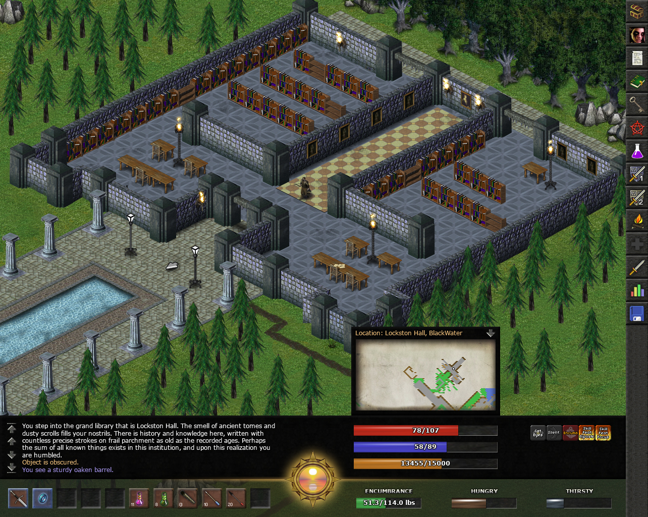
Here's my 1280 x 1024 UI idea with a closed map...
http://www.kxmode.com/eschalon/Eschalon ... ed-map.jpg
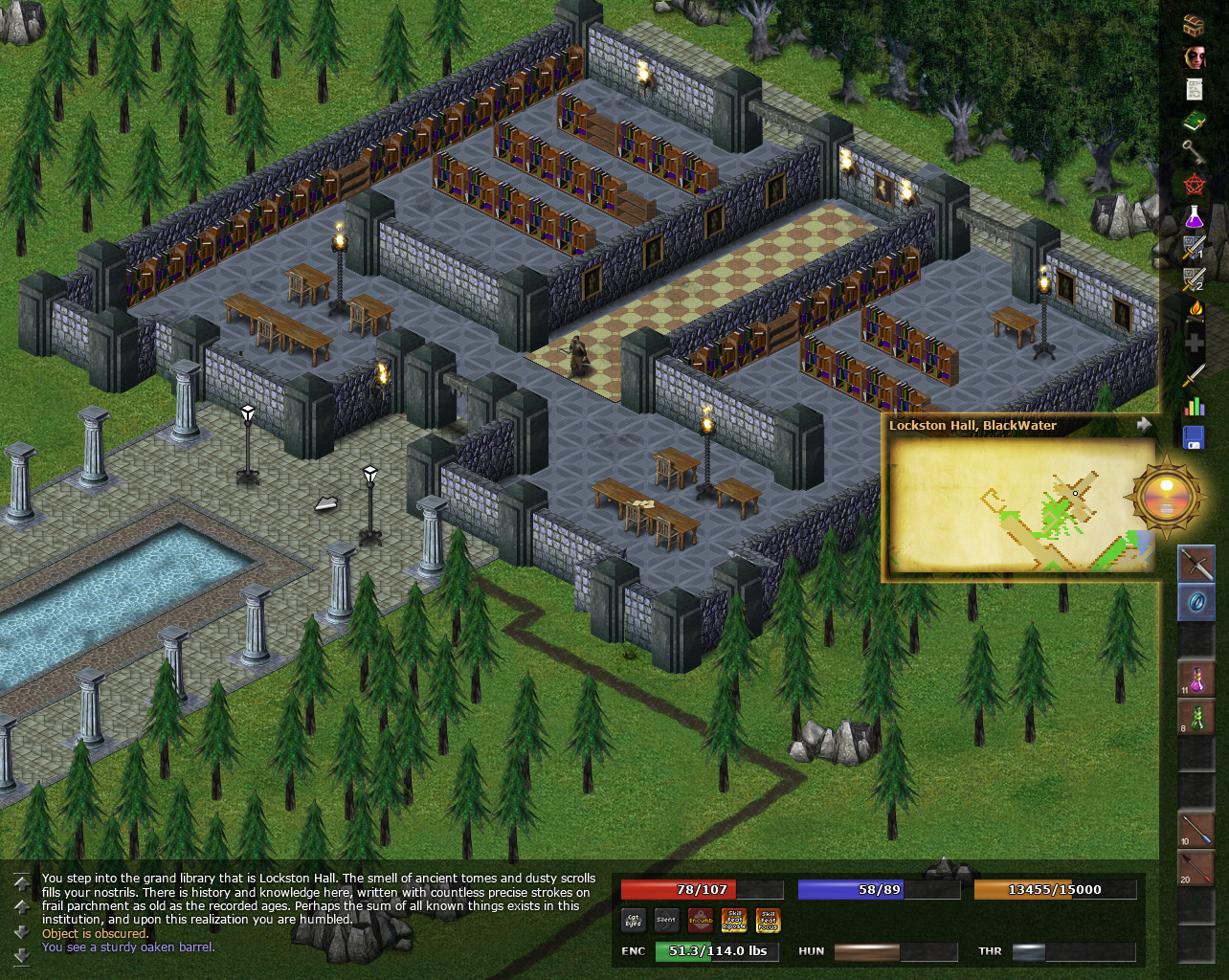
And the map opened.
http://www.kxmode.com/eschalon/Eschalon ... en-map.jpg
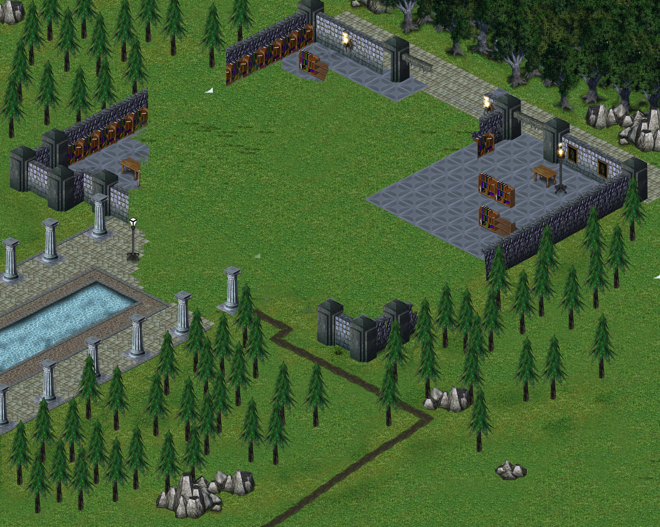
Here's the remastered screenshot with no UI elements or the original screenshot so you can see all the stuff I added.
http://www.kxmode.com/eschalon/Eschalon ... layout.jpg
And all of the nitty gritty things I digitally remastered. Notice the walkway with pool. I made that using elements from the original screenshot!
http://www.kxmode.com/eschalon/Eschalon ... prites.jpg
All in all I spent 7.5 hours making this. I had lots of fun! Hope it gives you some ideas Basilisk.

Re: Eschalon Book 3 conceptual UI (with images!)
Posted: April 29th, 2010, 6:48 am
by Nevermore
A cool example of what Book III would be.

Re: Eschalon Book 3 conceptual UI (with images!)
Posted: April 29th, 2010, 5:06 pm
by Arkos
Wait...you mean Eschalon III won't be re-envisioned to be a first person shooter?
:p
Re: Eschalon Book 3 conceptual UI (with images!)
Posted: April 29th, 2010, 6:24 pm
by Kreador Freeaxe
Arkos wrote:Wait...you mean Eschalon III won't be re-envisioned to be a first person shooter?
:p
Not unless EA makes BW an offer he can't refuse.
Re: Eschalon Book 3 conceptual UI (with images!)
Posted: May 8th, 2010, 1:20 am
by Aldbeski
man that is awesome now i could only wish that EB3 be even remotly close to that
Re: Eschalon Book 3 conceptual UI (with images!)
Posted: May 12th, 2010, 1:54 pm
by Sslaxx
SuPeR RaPPeR wrote:man that is awesome now i could only wish that EB3 be even remotly close to that
If BW is willing to pay Kxmode, it might be.
Re: Eschalon Book 3 conceptual UI (with images!)
Posted: May 22nd, 2010, 6:47 am
by Al3xand3r
I don't like the bottom part of the UI at all. Too much black, too many clean straight lines and stuff. And the bit popping off doesn't look good, closed or open, it should probably be in a corner instead. Maybe you could add an action bar with spell and skill shortcuts somewhere instead of that black space. But it's nice to see Eschalon in high res. I'd love to get an update for Book II that allows this even, if possible. For balance purposes it could have fog-of-war type (the see-through kind that leaves environments mostly visible but not enemies and other details) effects. The game's display is already low res as it is, and having the huge UI on top makes the viewed area too small. Oh well, it's still charming.
Re: Eschalon Book 3 conceptual UI (with images!)
Posted: May 31st, 2010, 12:27 am
by Evnissyen
Hmm... looks quite good. Nice work Kx.
I'm always a fan, of course, for the most efficient use of screen space.
Re: Eschalon Book 3 conceptual UI (with images!)
Posted: June 3rd, 2010, 9:58 am
by Kxmode
Thanks everyone!
Eschalon is such a wonderful looking game. I thought it would be great to minimize the user interface as much as possible in order to show more of the game world, especially if Book 3 increases to 1280 x 1024.
@Al3xand3r
I agree. Actually at one point I didn't have the black bar. I decided it was necessary for contrast reasons. One of the main goals of any UI is to give users quick access to important information. Having a strong contrast is a simple way to achieve this.
I'm tossing around the idea of going back and making the UI even more minimal, but I don't want to copy WOW's interface. That's too easy and not very challenging from a design perspective. I think Eschalon's UI should have a signature aesthetic all its own.
Re: Eschalon Book 3 conceptual UI (with images!)
Posted: March 18th, 2011, 10:58 pm
by Kxmode
Re: Eschalon Book 3 conceptual UI (with images!)
Posted: March 20th, 2011, 6:55 pm
by sirdilznik
I like the new updated concept. I like especially the semi-transparent border around the UI elements; as much as I liked the "stone" look of the official UI semi-transparency gives more room to the actual gameplay area and I'm a stickler for minimalist UIs and maximum gameplay area. The only thing I don't like is where the minimap is located, it's too obtrusive where you have it. I think it would be better in the upper corner.
Re: Eschalon Book 3 conceptual UI (with images!)
Posted: March 21st, 2011, 9:43 am
by IJBall
While I like what you've done here (though I agree with sirdilznik on the location of the Minimap) esp. in regards to making the actual playable screen area much larger, it should be noted that
BW has said that there will be no changes to the UI in Book III.
So, at this point, this is probably more of an 'academic' exercise that may still, nonetheless, influence BW on the design of UIs for future games...
Re: Eschalon Book 3 conceptual UI (with images!)
Posted: March 21st, 2011, 10:10 am
by Kxmode
sirdilznik wrote:I like the new updated concept. I like especially the semi-transparent border around the UI elements; as much as I liked the "stone" look of the official UI semi-transparency gives more room to the actual gameplay area and I'm a stickler for minimalist UIs and maximum gameplay area. The only thing I don't like is where the minimap is located, it's too obtrusive where you have it. I think it would be better in the upper corner.
Me too. The less the UI the better. Of course there's a trade-off between having no UI and showing critical information. There's also the issue of properly contrasting key elements of a UI namely all the icons and dialog text. The reason for the minimap's location is so that it is approximately level with the player's eye. That was one of the things I hated about minimaps in MMOs. They place it all the way up in the upper-right corner. I always felt it should be placed in the center-right of the screen so that it's on the same horizon line as the player's avatar. Less head moment equals less strain... you know, for us "older" gamers.
IJBall wrote:So, at this point, this is probably more of an 'academic' exercise that may still, nonetheless, influence BW on the design of UIs for future games...
That's pretty much all it is. I found it a fun exercise in UI game design.
Posted: March 21st, 2011, 11:05 am
by CrazyBernie

Perhaps with Book III the tools that BW includes will also contain information for modifying the UI as one sees fit... this could lead to user generated UI mods.
Re: Eschalon Book 3 conceptual UI (with images!)
Posted: March 22nd, 2011, 1:43 pm
by Enterian
Hi! nice job on redesigning the GUI Kxmode
While I like what you've done here (though I agree with sirdilznik on the location of the Minimap) esp. in regards to making the actual playable screen area much larger, it should be noted that BW has said that there will be no changes to the UI in Book III.
I believe one of the reasons why the GUI is a bit large and the active screen is a bit small, is the same as why the game resolution isn't Full-HD (or something like that
)
If I remember correctly, BW mentioned somewhere that the game engine would be slower if he would add a few more rows of tiles in the active screen.
If you increase the resolution or decrease the game GUI, you'll also have to draw more tiles on the screen each frame.
It's not only about drawing tiles, the lighting needs to be calculated for each visible tile as well.
Even though it probably won't happen, I think the only way BW would do this is after it's obvious from for example a poll on the forums, that most people have more powerfull computers with a fast graphics card than the time Book I came out.
personally, I like the way it is in Book II (game-res & GUI size). I got used to it within no time:)